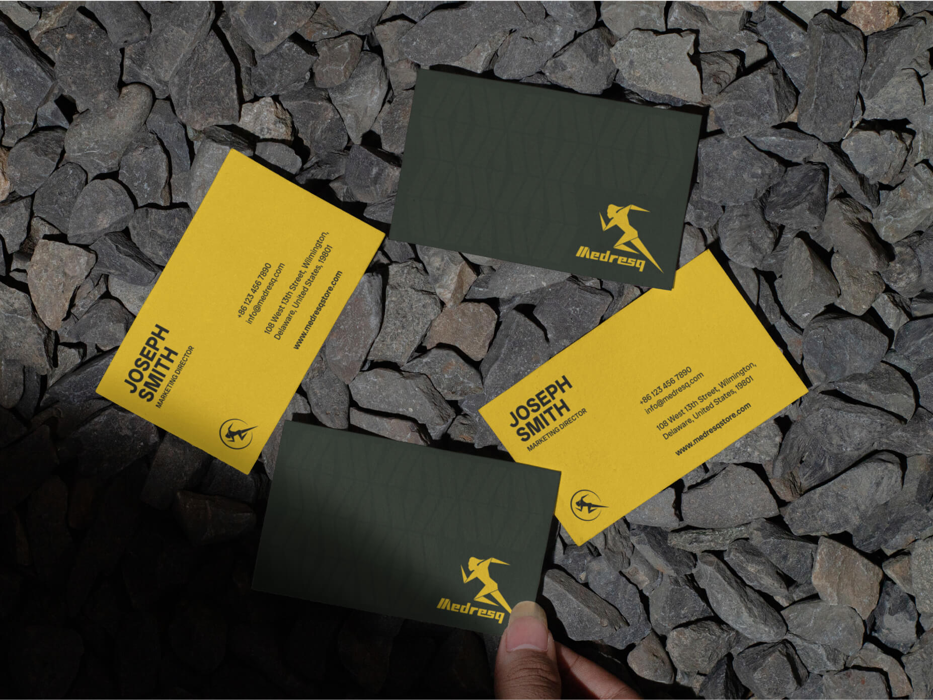
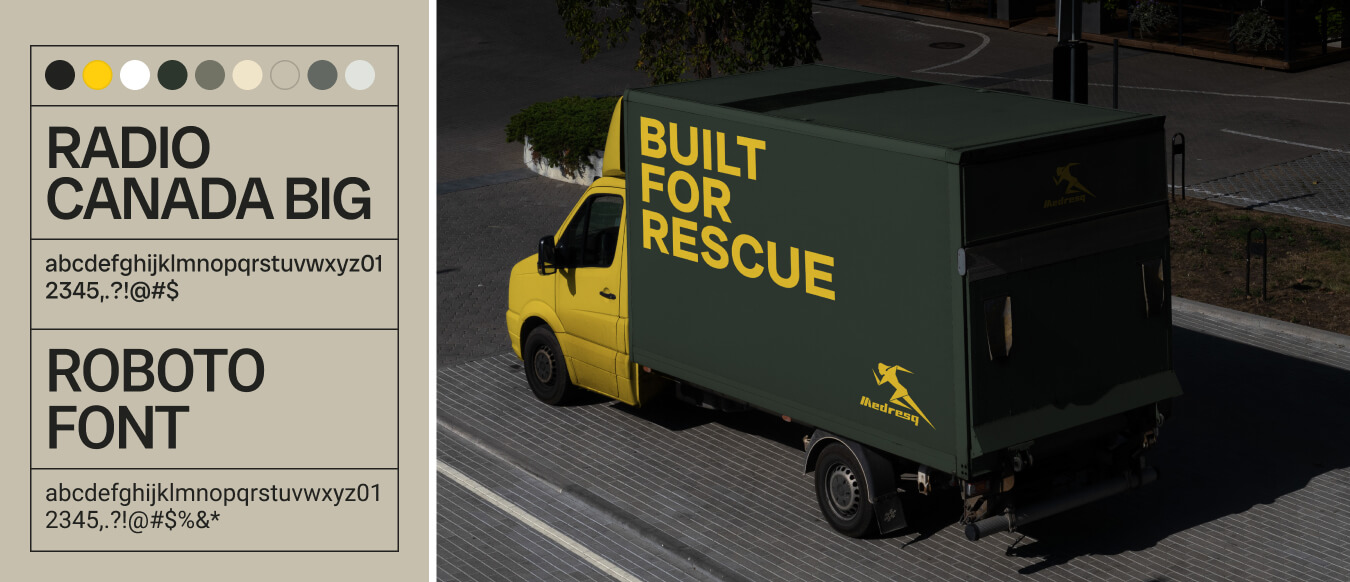
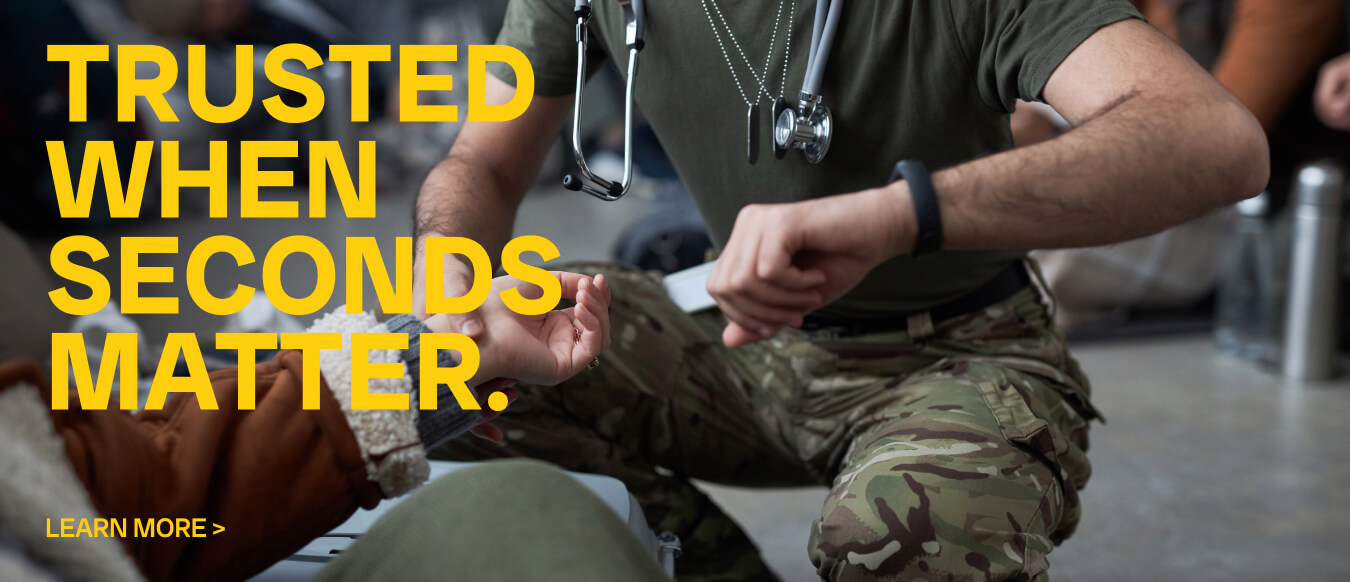
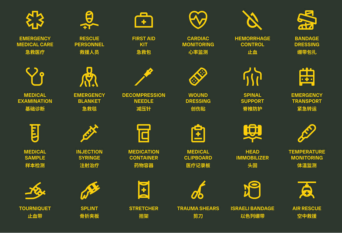
Medresq Branding Brand visual identity

How we reframed Medresq as a system

The Client

The Client

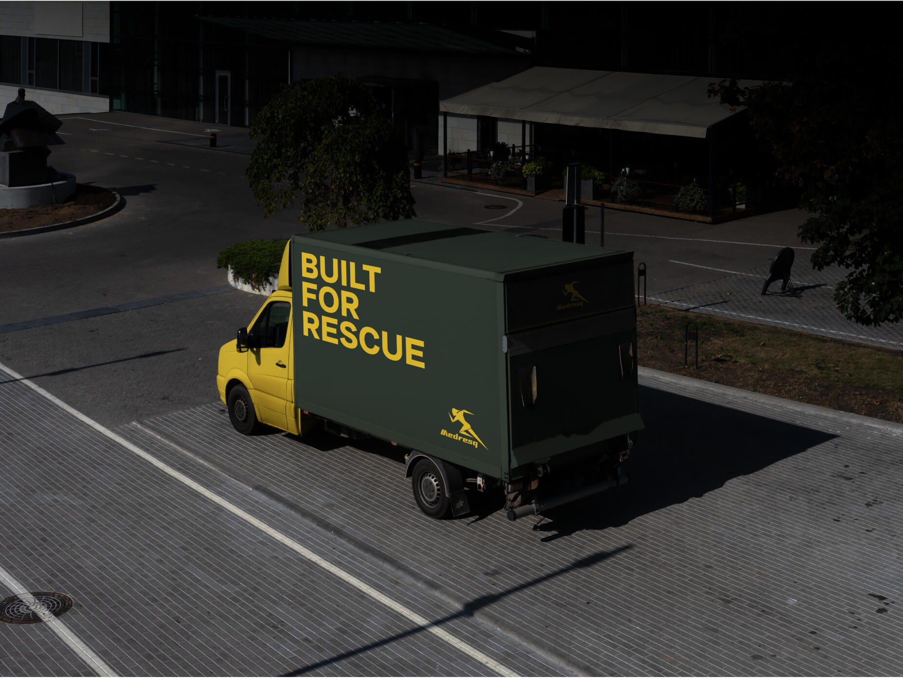
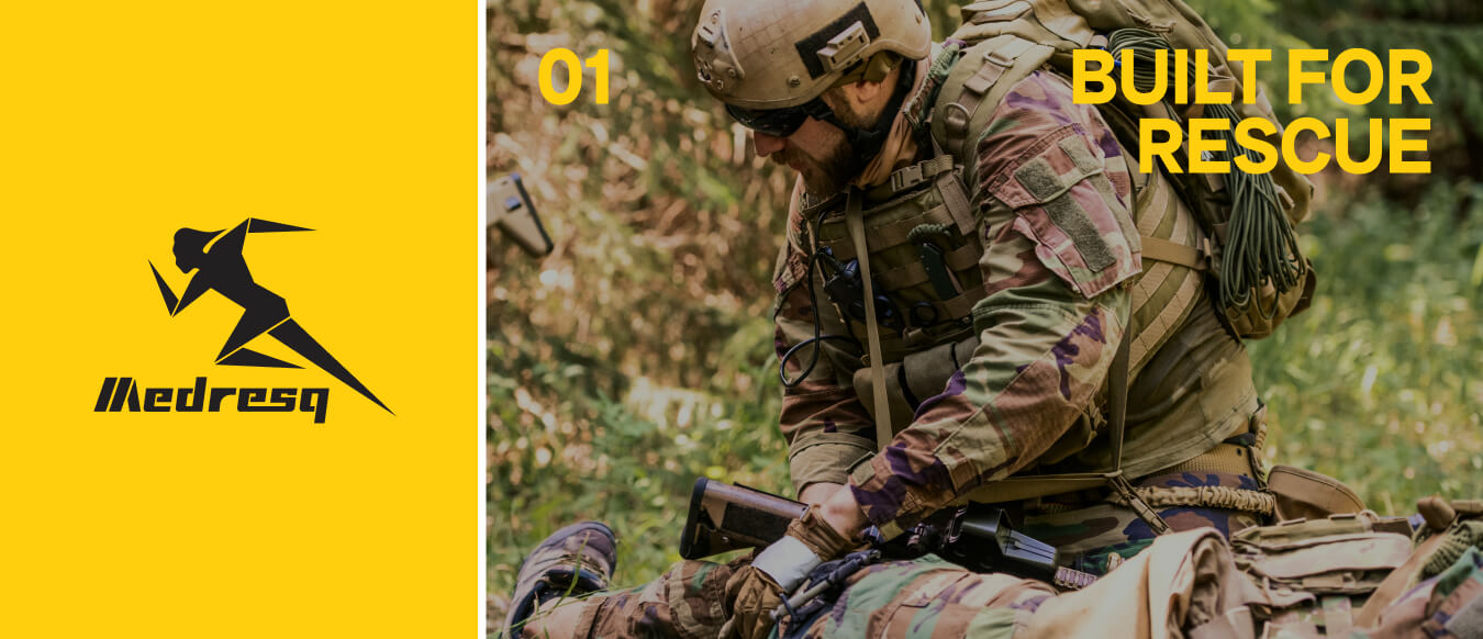
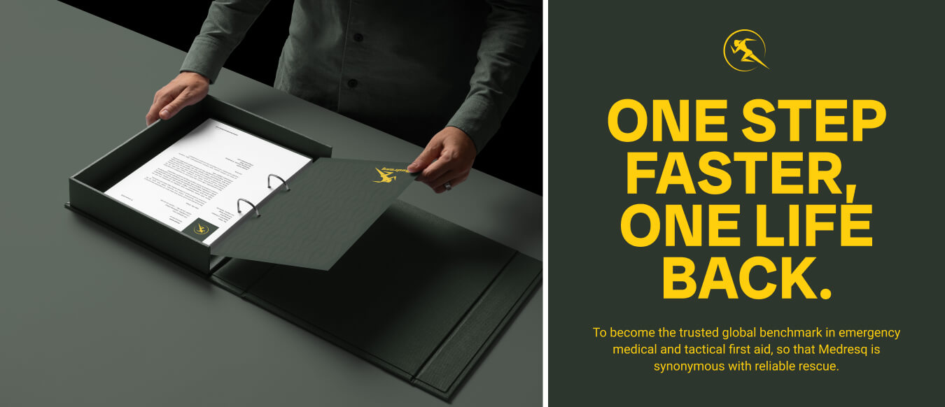
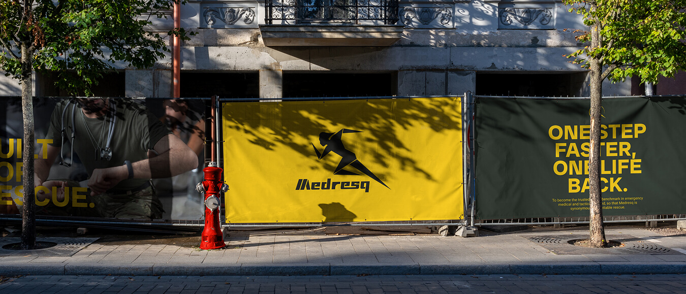
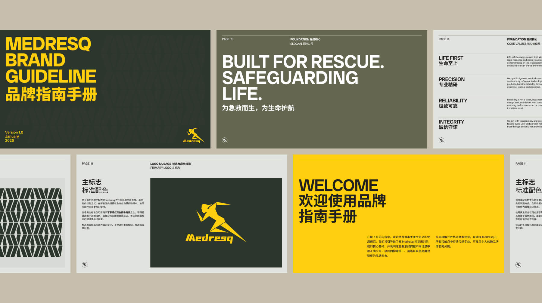
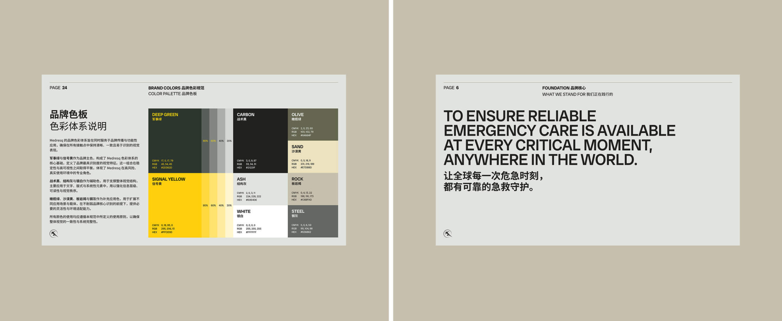
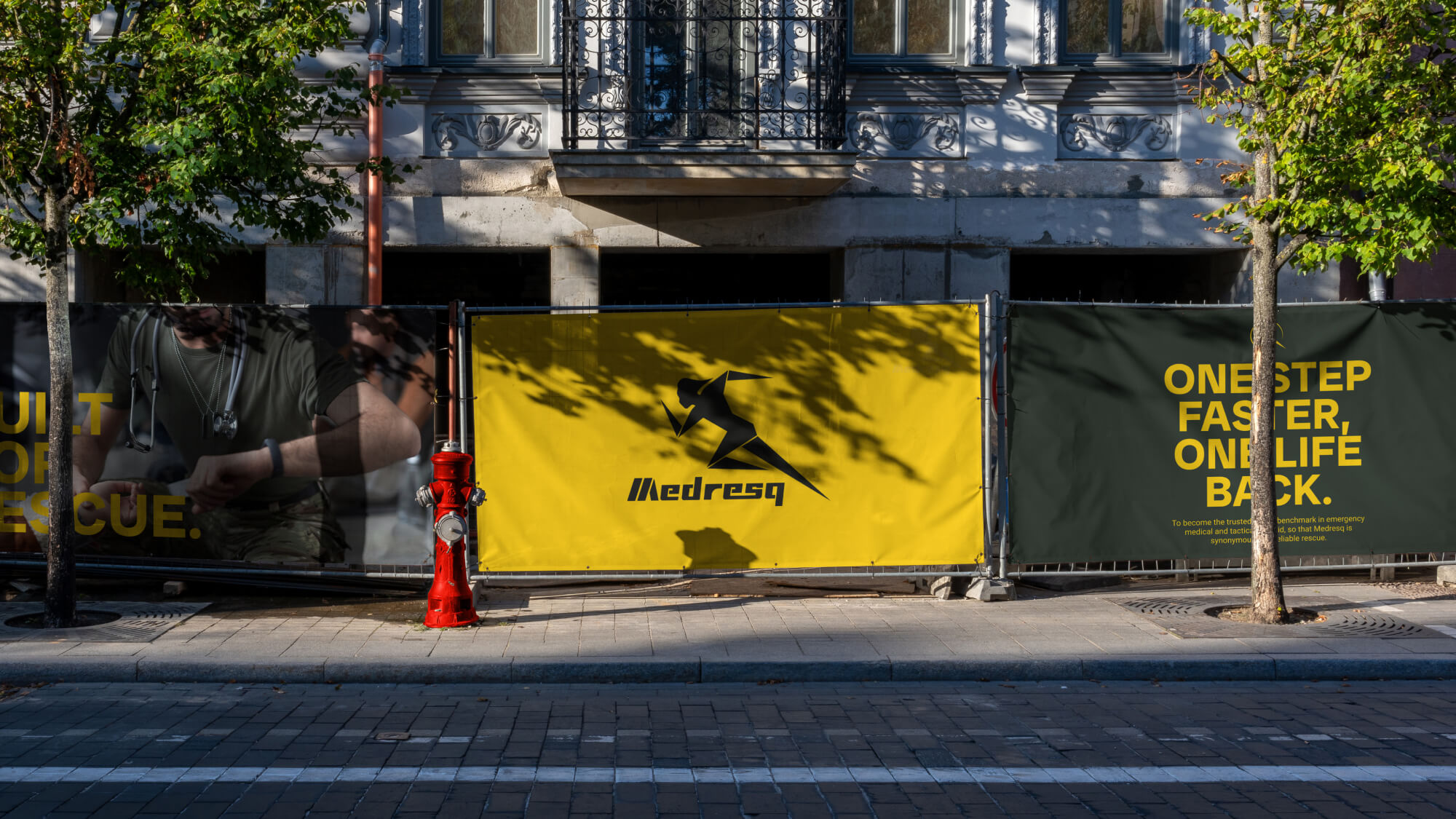
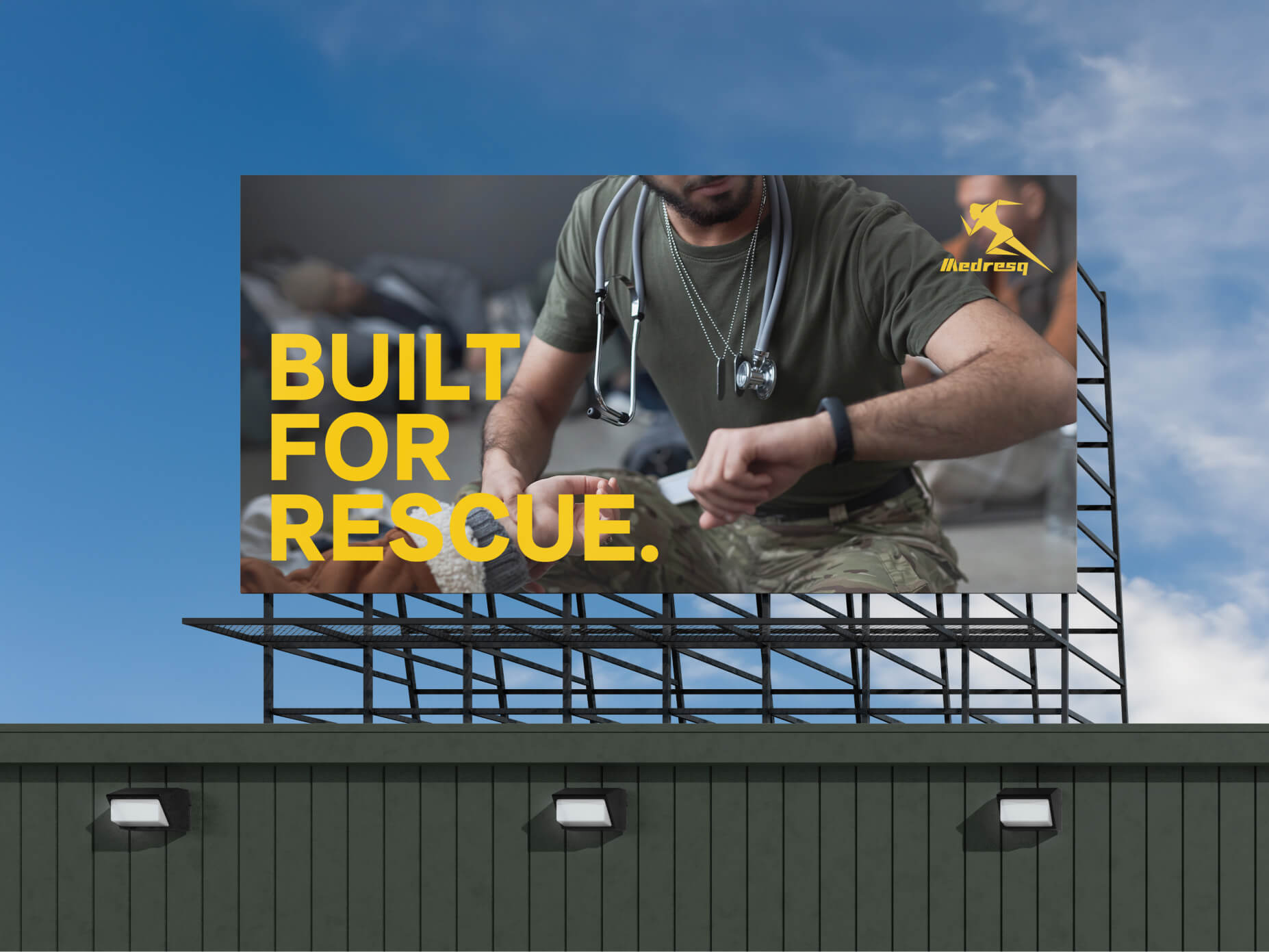
Medresq is a brand focused on emergency medical care, providing products and solutions for emergency response scenarios. The brand concentrates on on-site rescue, medical support, and transport-related applications, serving environments that require rapid response and professional assistance. Its product range includes emergency equipment, essential medical tools, and related support items, developed to meet the practical demands of high-intensity and time-critical situations.

The Challenge

The Challenge

Medresq already had a registered logo; however, due to its distinctive form, integrating it consistently across different media and applications proved challenging. The brand lacked a cohesive visual language, resulting in fragmented communication, limited memorability, and a less defined overall impression. The core challenge of this project was to retain the existing logo while building a more unified and recognizable visual system—one that enhances memorability, conveys a refined and professional image, and aligns with the aesthetic preferences of its target audience. At the same time, this presented an opportunity to elevate the brand and establish a stronger foundation for long-term development.

Our Solution

Our Solution

Before moving into the design phase, we conducted a structured brand style research for Medresq, reviewing its primary and adjacent markets to understand the existing visual landscape. Through industry analysis, competitive benchmarking, and audience preference insights, we clarified Medresq’s positioning—centered on a military-inspired visual language, rapid response, professionalism, and direct communication.Based on this direction, we adopted camouflage as a foundational visual element and reinterpreted it through a modern lens. The pattern was refined and simplified to retain its military character and sense of structure, while achieving a cleaner, more contemporary and distinctive identity. By integrating a cohesive color system, structured graphic language, and disciplined layout principles, we built a unified and memorable visual system that allows Medresq to remain professional and trustworthy while being clear, modern, and easily recognizable across applications.

Let's turn your idea into reality!

What type of service you would like to inquire?

    CREATIVE. PASSIONATE. DATA-DRIVEN.