Inkwon Rebranding Brand visual identity

A brand visual system built for growth

The Client

The Client

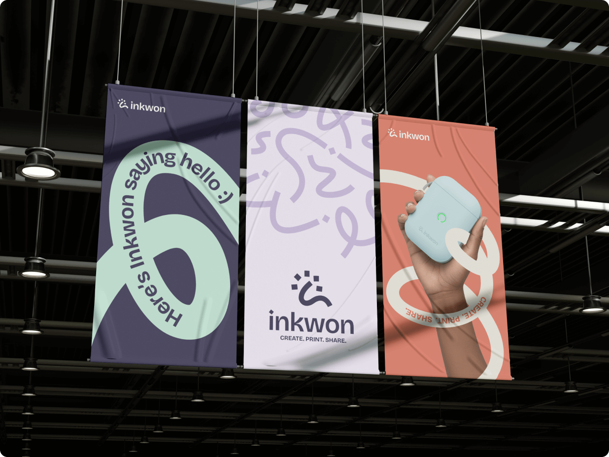
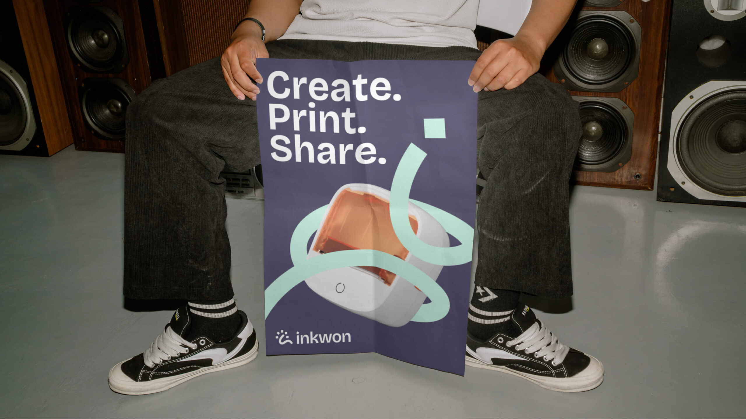
Founded in 2017, Inkwon is a consumer electronics brand specializing in portable thermal printers and related accessories. Its products are designed for everyday use across learning, office, organization, and creative scenarios, serving both individual users and small teams. Beyond hardware, Inkwon has developed a broader product ecosystem that includes printing devices, consumables, companion software, and scenario-based usage content. The brand focuses on balancing usability, reliability, and approachable design, and reaches its audience primarily through online channels across multiple markets.

The Challenge

The Challenge

As Inkwon continued to grow, the brand began to move beyond a purely product-driven stage, creating a need for a more cohesive and recognizable brand expression. While Inkwon already had a logo and basic color palette in place, the existing smile-icon logo, though approachable and easy to recognize, relied on a visual language commonly seen across the consumer electronics and printing market, offering limited differentiation. At the same time, the brand’s visual elements lacked a unified system, making it difficult to maintain consistency across touchpoints. The core challenge of this project was therefore to preserve Inkwon’s friendly character while building a more distinctive, systematic, and scalable visual identity capable of standing out in a highly competitive and saturated market.

Our Solution

Our Solution

To support Inkwon’s long-term brand recognition and system scalability, we rebuilt the visual identity from the ground up. Prior to the design phase, we conducted an in-depth industry visual research and benchmarking study, analyzing market dynamics and competitor visual languages to identify differentiation opportunities and align with the aesthetic preferences of Inkwon’s target audience—young users drawn to novelty, creativity, and expressive design. The new logo is inspired by the continuous strip of paper produced by Inkwon’s printers and takes the letter “i” from the brand name as its core form, abstracted to express the moment when inspiration strikes and ideas take shape. Alongside the logo, we introduced a bolder and more youthful color strategy to strengthen memorability, while carefully controlling color hierarchy to preserve a modern and mature tone. The curved graphic elements derived from the logo were further developed into a flexible core visual system, seamlessly extending across patterns, backgrounds, and brand communications, resulting in a cohesive identity that is both distinctive today and scalable for Inkwon’s future growth.

Let's turn your idea into reality!

What type of service you would like to inquire?

    CREATIVE. PASSIONATE. DATA-DRIVEN.